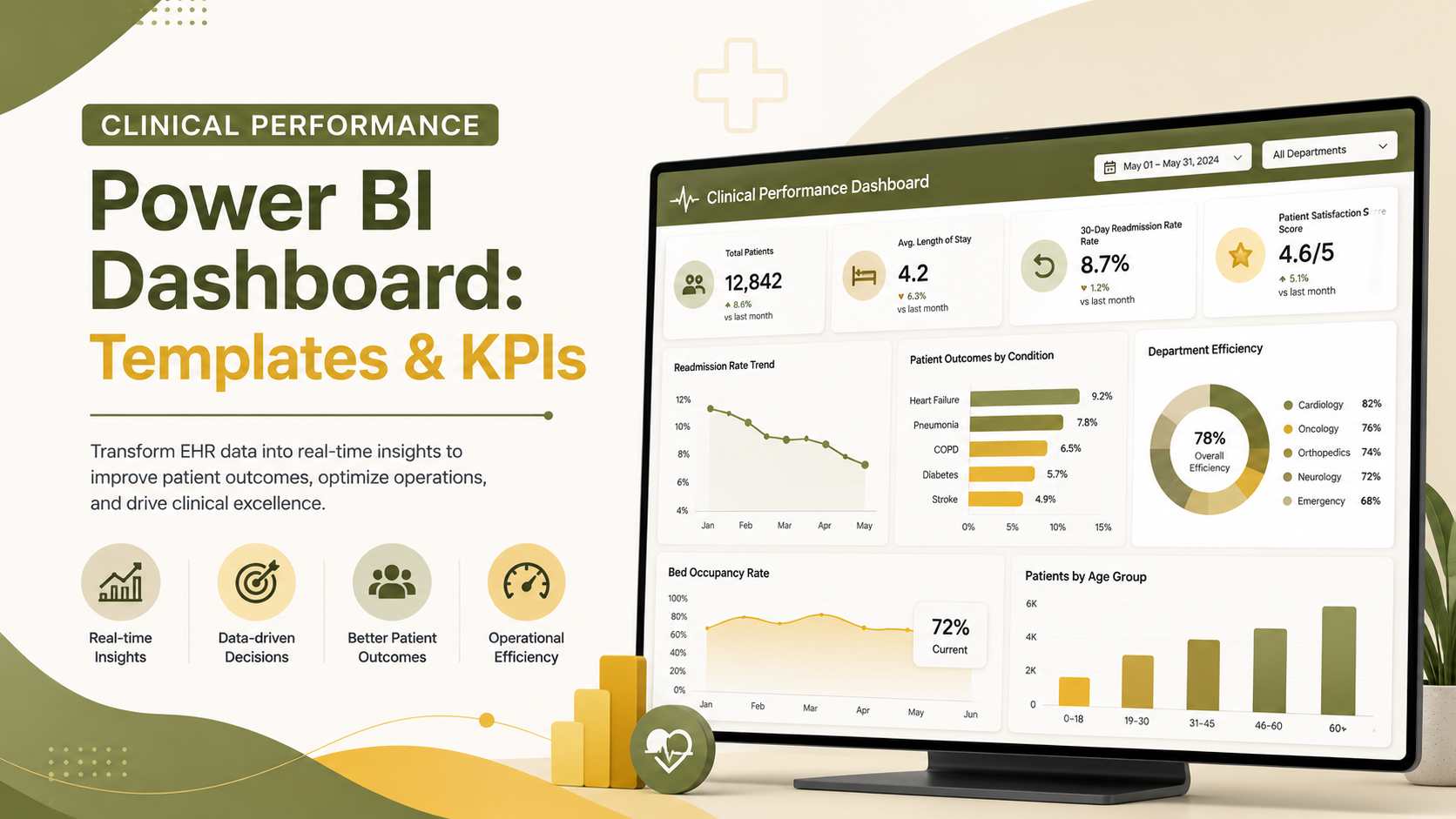
Clinical Performance & Patient Analytics Power BI Dashboard: Templates, Examples and KPIs
Clinical performance Power BI dashboards transform scattered electronic health record (EHR) data into real-time visual intelligence. They let healthcare leaders track patient outcomes, readmission rates, and department efficiency with precision. Modern healthcare organizations struggle with data fragmentation across multiple systems, delayed reporting cycles, and limited visibility into what’s actually driving clinical quality and operational performance. This guide explores how clinical dashboards powered by Power BI bridge that gap, featuring real-world examples, essential KPIs, and implementation insights from healthcare analytics experts.
Key Takeaway
A clinical performance Power BI dashboard consolidates patient analytics from multiple sources, enabling clinicians and administrators to identify performance trends, benchmark against standards, and make faster, data-driven decisions that improve outcomes and reduce readmission penalties.
In This Article
- Why Clinical Performance Dashboards Matter Now
- Core Challenges Healthcare Teams Face Without Clinical Dashboards
- The Solution: Clinical Performance & Patient Analytics Power BI Dashboards
- Real-World Clinical Dashboard Examples & Use Cases
- Critical Clinical Performance KPIs to Track
- Key Design & Implementation Considerations
- Frequently Asked Questions
Why Clinical Performance Dashboards Matter Now
Healthcare organizations face unprecedented pressure to shift from volume-based to value-based care delivery. Readmission penalties, quality reporting mandates, and physician burnout create an urgent need for real-time visibility into clinical metrics. A clinical performance Power BI dashboard isn’t a luxury. It’s becoming a competitive necessity.
The shift toward accountability-based reimbursement means hospitals can’t afford delayed reporting cycles or siloed data anymore. When a department director waits until month-end reporting to discover a 10-day variance in treatment turnaround time, the opportunity to intervene has already passed. Real-time dashboards change that dynamic entirely.
“Hospitals with real-time clinical performance visibility reduce 30-day readmissions by identifying at-risk discharge cohorts and triggering targeted case management within 24 hours of discharge.”
Healthcare Financial Management Association (HFMA), 2023
Beyond financial penalties, patient safety and clinical outcomes depend on rapid feedback loops. When clinicians see their performance relative to peers and evidence-based benchmarks, they optimize practice patterns. Transparency drives accountability and improvement. But only when the data is trustworthy, timely, and actionable.
Core Challenges Healthcare Teams Face Without Clinical Dashboards
Healthcare organizations operating without unified clinical performance dashboards run into predictable obstacles:
- Data fragmentation across systems: EHR, billing, quality management, and staffing data sit in separate repositories with no single source of truth for readmission rates, mortality, or treatment delays.
- Delayed reporting cycles: Monthly or quarterly reports arrive weeks after events occur, making real-time intervention impossible and reducing the relevance of insights.
- Inability to drill down: Leadership sees hospital-level KPIs but can’t pinpoint whether readmission spikes originate in a specific department, shift, or patient cohort.
- Compliance reporting delays: Manual data extraction and reconciliation for CMS, Joint Commission, or HCAHPS reporting consume time and introduce transcription errors.
- Limited benchmarking: Without peer comparison and evidence-based targets, departments can’t assess whether their performance is acceptable or requires urgent intervention.
- Staff accountability gaps: Without transparent, peer-referenced metrics, clinicians lack clear feedback on quality and efficiency performance relative to their peers.
The consequence is a reactive rather than proactive organization. Clinical decisions happen in meetings rather than in real time. Quality improvement initiatives lack data-driven focus. Regulatory penalties accumulate.

The Solution: Clinical Performance & Patient Analytics Power BI Dashboards
A clinical performance Power BI dashboard solves each pain point by creating a unified, real-time view of clinical and operational data. Here’s how it works:
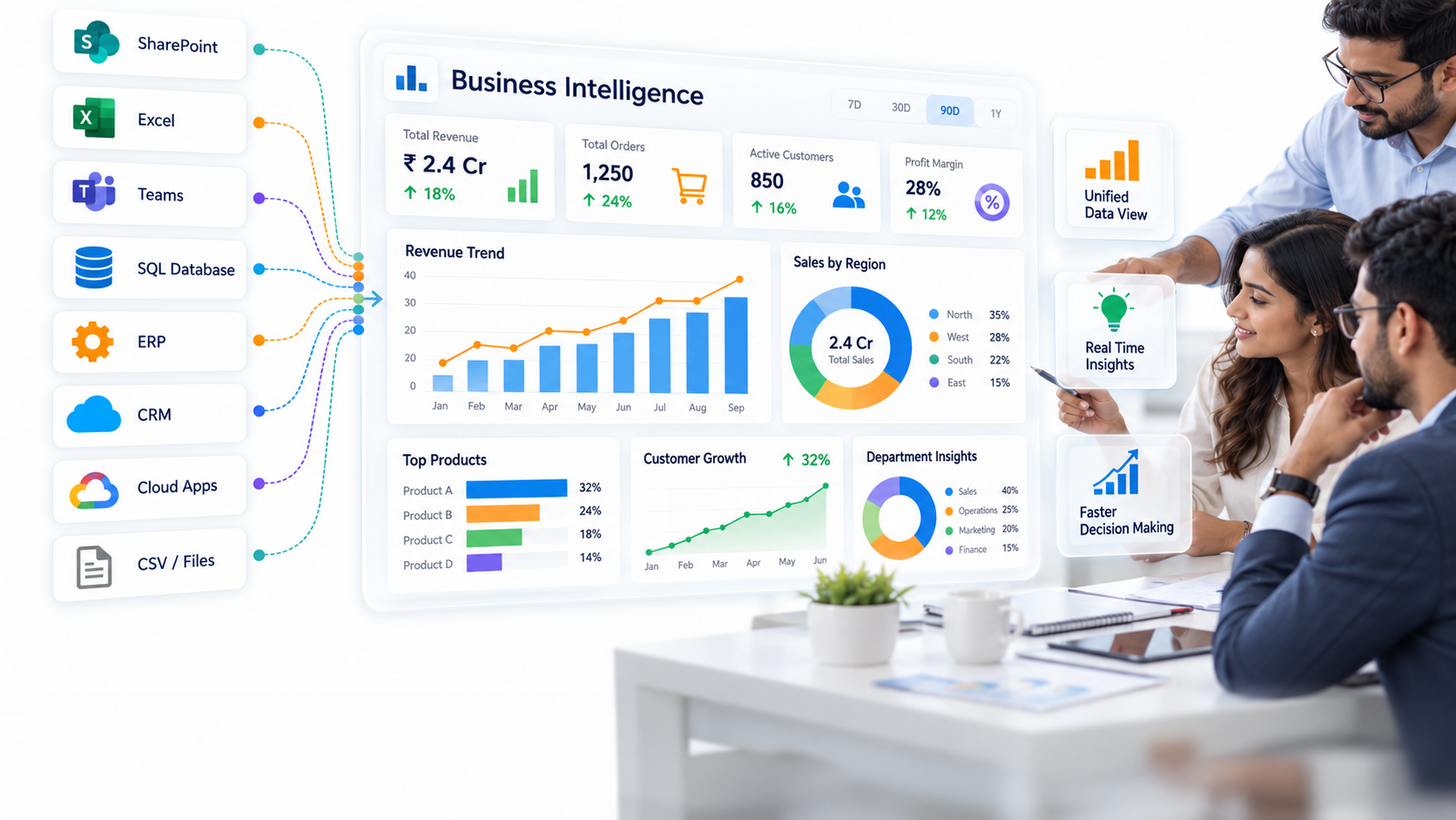
EHR Integration and Data Unification: Power BI connects directly to major EHR systems like Epic, Cerner, and Medidata through secure connectors and industry-standard APIs (HL7, FHIR). Instead of pulling reports manually, dashboards refresh hourly or on-demand. They combine admission timelines, discharge outcomes, and quality metrics in one place.
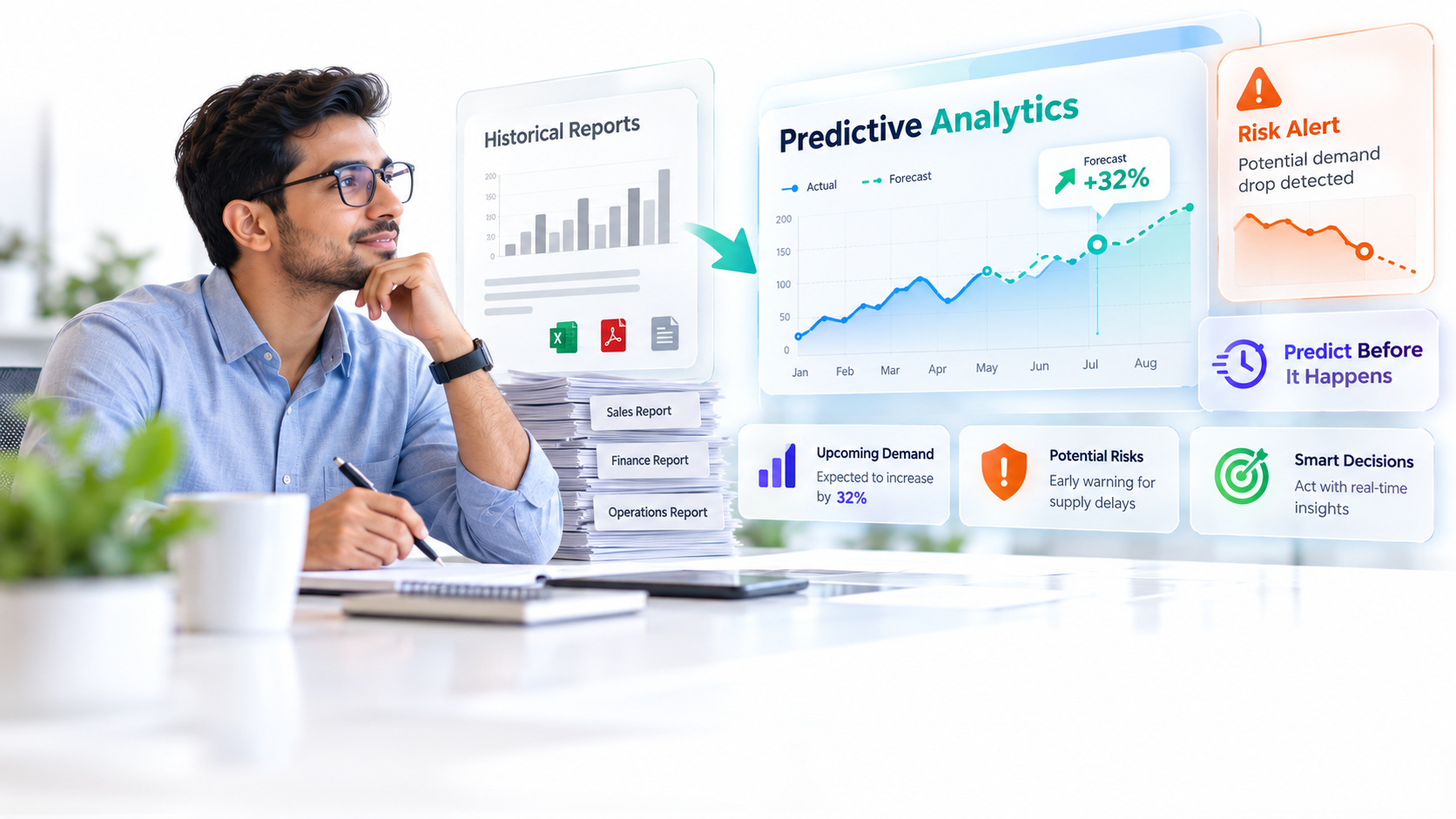
Real-Time Monitoring and Alerts: Clinical performance Power BI dashboards track metrics as events occur. A readmission rate spike or high-risk patient discharge triggers immediate visibility to case management teams. Treatment turnaround time bottlenecks become visible within minutes, not weeks.
Drill-Down and Accountability: Hospital leaders see overall readmission rates, then drill down to service lines, individual departments, shifts, and patient cohorts. This transparency enables targeted intervention without creating individual “scorecards” that alienate clinicians.
Automated Compliance Reporting: Pre-built KPI definitions align with CMS, Joint Commission, and AHRQ standards. What once required manual data extraction now happens automatically, reducing errors and accelerating regulatory submissions.
Peer Benchmarking and Variance Analysis: Dashboards compare internal performance against national or peer institution averages, highlighting outliers and improvement opportunities.
Expert Perspective
In our work with healthcare teams, the most effective clinical performance Power BI dashboards blend operational metrics (turnaround times, bed utilization) with clinical quality metrics (readmission rates, infection rates) and patient experience data (HCAHPS scores). This balanced view helps clinicians see how quality and efficiency interconnect, preventing the false choice between speed and safety. Here’s the thing most implementations miss: success requires involving clinicians in KPI selection. Dashboards imposed from above without clinical buy-in often fail or drive unintended behaviors.
Real-World Clinical Dashboard Examples & Use Cases
Patient Outcome Dashboard
This clinical performance dashboard tracks 30-day readmission rates by diagnosis, discharge destination, insurance type, and patient demographics. Clinicians and case managers identify high-risk cohorts: patients discharged to unstable home environments or without reliable follow-up appointments. Then they flag them for proactive intervention.
A patient outcome dashboard visualizes trending readmission rates against national and specialty-specific benchmarks using Power BI KPI cards and trend lines. When readmission rates exceed thresholds, alerts notify quality and case management leadership.
Readmission Rate Dashboard
A dedicated readmission rate dashboard surfaces root causes: medication non-adherence, delayed follow-up appointments, gaps in care coordination, or inadequate discharge planning. Drill-down capability lets leaders move from hospital-level performance to individual physician or department views without creating a surveillance culture.
This type of clinical performance Power BI dashboard includes leading indicators, like follow-up appointment scheduling rate and medication reconciliation completion. Those predict readmission risk before discharge even occurs.
Treatment Turnaround Time Dashboard
For acute conditions, every minute matters. Door-to-balloon time for cardiac events, door-to-CT time for stroke, lab result-to-medication administration times: these are critical performance metrics. A treatment turnaround time dashboard visualizes these metrics in real time, highlighting bottlenecks by shift, department, and day of week.
Heat maps show which ED shifts struggle with boarding delays or which imaging departments experience unexpected backlogs. Operational leaders identify equipment failures, staffing gaps, or workflow inefficiencies immediately. Not weeks later.
Department Performance Dashboard
Department directors need a unified view of their operations: bed utilization, patient flow, staffing ratios versus acuity-adjusted demand, safety incidents, and clinical outcomes. A department performance clinical performance Power BI dashboard enables side-by-side comparison of these elements. It helps directors justify resource requests or identify improvement opportunities.
ED directors see that weekend boarding times exceed weekday performance, revealing the need for extended staffing. Surgical departments track case cancellations and identify scheduling or OR turnover inefficiencies.
Physician Peer Comparison Dashboard
This sensitive dashboard aggregates clinical quality metrics (complication rates, readmission rates, patient satisfaction) without creating individual “scorecards.” Instead, it benchmarks each physician against specialty-specific peer norms and national averages. It frames comparison as a tool for collaborative improvement. Not punishment.
Physicians with outlier performance receive support for root cause analysis and evidence-based protocol review, not performance reviews.

Critical Clinical Performance KPIs to Track
Effective clinical performance Power BI dashboards focus on KPIs that matter clinically and operationally. Here are the most important metrics:
Patient Outcome KPIs
- 30-day readmission rate: Unplanned hospital returns within 30 days of discharge, broken down by condition, patient demographics, and discharge destination.
- In-hospital mortality rate: Risk-adjusted mortality accounting for case severity and patient comorbidities, compared against peer and national benchmarks.
- Hospital-acquired infection (HAI) rate: Tracked per 1,000 patient-days for central line-associated bloodstream infections (CLABSI), catheter-associated urinary tract infections (CAUTI), and surgical site infections.
- Patient safety events: Never events, falls with serious injury, and medication errors tracked with root cause analysis.
Operational KPIs
- Average length of stay (LOS) and LOS variance: Both benchmarked against DRG-adjusted expectations, highlighting unexpected delays.
- Door-to-balloon time: For acute myocardial infarction, measured from ED arrival to coronary intervention.
- Door-to-CT time: For suspected stroke, measured to imaging completion.
- Lab result turnaround time: From order entry to result reporting, segmented by test type and time of day.
- Discharge documentation time: From discharge order to final documentation in the EHR, affecting bed turnover and readmission risk.
Quality & Compliance KPIs
- HCAHPS scores: Patient satisfaction measures for cleanliness, communication, responsiveness, and pain management.
- Evidence-based protocol compliance: Sepsis bundle completion, VTE prophylaxis use, and antibiotic stewardship adherence.
- Medication error rate: Near-misses and actual errors per 1,000 medication orders.
- Physician credentialing compliance: Timely license verification and re-credentialing completion.
Departmental KPIs
- ED boarding time and left-without-being-seen (LWBS) rate: Patients leaving before evaluation due to long wait times.
- ICU bed utilization and turnover time: Time from discharge to next admission, indicating cleaning and staffing efficiency.
- OR scheduling efficiency: Case start delays, case cancellations, and turnover time between cases.
- Staffing ratios versus acuity-adjusted targets: RN-to-patient ratios compared to acuity benchmarks by unit.
Key Design & Implementation Considerations
Building a clinical performance Power BI dashboard requires more than technical expertise. Healthcare-specific governance, clinical validation, and change management are essential.
Data Governance and Access Control
Clinical performance dashboards contain sensitive patient and physician performance data. Role-based access control ensures that physicians see their own metrics plus de-identified peer comparison data. Administrators access hospital-level aggregates. Audit trails document every dashboard view for HIPAA compliance. Data governance policies define who owns KPI definitions, who validates data quality, and who approves new metrics.
Clinical Validation of KPIs
Here’s the thing most guides won’t tell you: engage clinicians in selecting KPIs. Avoid metrics that drive unintended behaviors. For example, readmission reduction metrics that incentivize premature discharge. Clinical leadership should co-design thresholds and alert triggers based on evidence and organizational capacity, not arbitrary numbers. Involve nursing, physician, and case management leadership in dashboard design reviews before launch.
Integration Architecture
You’ve got to decide whether to use direct EHR connectors, a data warehouse staging layer, or API-based refresh. Direct connectors offer real-time data but can stress EHR systems. A data warehouse staging layer centralizes security controls, data quality checks, and HIPAA compliance. It introduces a slight delay. Generally speaking, most healthcare organizations find a hybrid approach optimal: real-time operational metrics flow through APIs; clinical outcomes use nightly data warehouse refreshes.
Alert Thresholds and Tuning
Set alert thresholds based on evidence, not guesswork. When readmission rates exceed a statistically significant threshold or when door-to-balloon times exceed guideline targets, dashboards alert relevant teams. Poor thresholds cause alert fatigue, which leads clinicians to ignore the dashboard. Involve clinical leadership in ongoing tuning. Some thresholds may need monthly adjustment based on patient population changes or seasonal trends.
Change Management and Clinical Buy-In
Clinicians may resist dashboards perceived as surveillance tools. That’s real, and worth taking seriously. Frame them as shared learning platforms where teams identify barriers to quality and collaborate on improvement. Include physicians in governance. Physician leaders champion adoption more effectively than IT leaders. Offer training sessions for different user groups: quick ED director overview, detailed drill-down for department managers, peer comparison orientation for individual physicians. Early adopters and physician champions are invaluable.
Frequently Asked Questions
How do we integrate a clinical performance Power BI dashboard with our EHR system securely?
Power BI supports direct connectors to major EHRs (Epic, Cerner, Medidata) and standard healthcare protocols (HL7, FHIR). That said, most organizations we work with recommend a secure staging layer: a data warehouse or Azure Data Lake where data is centralized, encrypted, and accessed through role-based controls. This approach protects the EHR from excessive query load while providing a single source of truth for clinical performance metrics. Your IT and compliance teams should design the architecture to meet HIPAA encryption, audit, and data retention requirements.
Can we measure individual physician performance on clinical dashboards without creating a surveillance culture?
Yes, when framed carefully. Focus on peer comparison and specialty-specific benchmarks rather than absolute rankings. Aggregate data at the team level first. Then use individual physician metrics for collaborative quality review rather than disciplinary action. Transparent methodology matters. Clinicians must understand how metrics are calculated and risk-adjusted. Involve physician leadership in metric selection and threshold setting. Frame outliers for clinical discussion and improvement support, not punishment.
What’s the difference between a clinical dashboard and an operational dashboard?
Clinical dashboards emphasize patient safety and quality outcomes: readmission rates, mortality rates, infection rates, and evidence-based care compliance. Operational dashboards focus on workflow efficiency: bed utilization, turnaround times, staffing ratios, and scheduling delays. In most cases, the most effective implementations blend both perspectives. Quality and efficiency are interdependent. A dashboard showing only one risks optimizing for speed at the expense of safety, or vice versa. Senior leadership benefits from an integrated view.
How frequently should clinical performance Power BI dashboard data refresh?
Critical metrics (admissions, discharges, safety events, critical lab results) should refresh hourly or more frequently. Trending and outcome metrics (readmission rates, mortality rates, infection rates) can refresh daily or weekly. Real-time doesn’t always mean better. Clinician trust in data quality matters more than refresh frequency. A daily readmission report that clinicians trust is more valuable than a real-time report containing data quality issues that clinicians doubt.
What KPIs should a readmission rate dashboard include?
Primary KPI: 30-day unplanned readmission rate (hospital-wide, by service line, by condition). Drill-down dimensions: diagnosis (DRG), age group, insurance type, discharge destination (home, skilled nursing facility, rehab), comorbidities. Context metrics: 7-day readmissions (high-risk indicator), avoidable versus unavoidable readmissions (requires clinical review), readmission primary diagnosis (same versus different from index admission). Pair clinical outcome metrics with leading indicators: follow-up appointment scheduling rate, medication reconciliation completion, discharge communication quality score. Leading indicators predict readmission risk and guide preventive intervention before discharge occurs.
Transform Your Clinical Data Into Actionable Intelligence
AscenWork helps healthcare organizations design and implement clinical performance Power BI dashboards that drive real outcomes. We combine healthcare domain expertise with Power BI technical mastery, ensuring your dashboard is clinically validated, HIPAA-compliant, and adopted by your clinician teams. Let’s turn your EHR data into the insights that improve patient care.