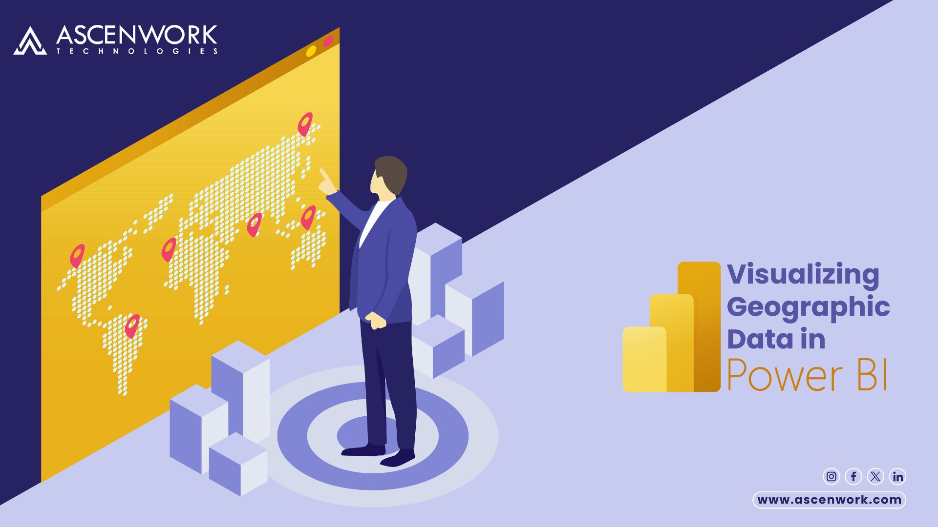
Unlock the potential of geographic insights in your data with Power BI! Our latest article delves into the intricate world of mapping and location analytics.
In today’s data-driven world, geographical context is crucial for meaningful insights. Whether you’re in the IT industry or exploring cutting-edge technologies, understanding how to effectively visualize geographic data in Power BI can elevate your analytics game.
Filtering and Slicing Your Map Data in Power BI for Better Analysis
Filtering and slicing your map data in Power BI for better analysis enhances your insights exponentially. Firstly, start by isolating relevant data points using Power BI’s robust filtering options. Then, refine your analysis by slicing the data along various dimensions, such as time, geography, or product categories. This strategic approach allows for a granular examination of trends and patterns, thereby facilitating informed decision-making. Ultimately, leveraging these techniques empowers users to derive actionable insights and drive business growth effectively.
Best Practices for Designing Effective Mapping Visualizations in Power BI
When crafting mapping , adhering to best practices is paramount for effectiveness. Firstly, consider the purpose of your map and the audience it serves. Secondly, choose appropriate map types based on your data and analysis goals, whether it’s choropleth, bubble, or filled map. Thirdly, ensure clarity by utilizing intuitive color schemes, legends, and tooltips. Additionally, optimize map interactions by enabling zoom, pan, and tooltips for enhanced user engagement. Moreover, incorporate geocoding and custom map layers to add context and depth to your visualizations. By following these best practices, you can create compelling mapping visuals that drive meaningful insights and decision-making in Power BI.
Adding Custom Maps to Power BI for More Accurate Visualizations
Enhancing the accuracy of your visualizations in Power BI involves integrating custom maps into your repertoire. Firstly, assess your data needs and determine the geographical context required for precise analysis. Next, explore sources for custom maps, such as Shapefiles or Geo JSON files, aligning with your specific regions of interest. Once acquired, seamlessly integrate these custom maps into Power BI using the built-in mapping capabilities. Moreover, customize map layers, styles, and labels to harmonize with your data presentation. By incorporating custom maps, you elevate the accuracy and relevance of your visualizations, enabling deeper insights and informed decision-making within Power BI’s dynamic environment.
Geospatial Data Analysis in Power BI
Geospatial data analysis within Power BI harnesses the power of location intelligence for robust insights. Primarily, start by importing geospatial datasets, including maps, coordinates, and boundaries, into Power BI’s intuitive interface. Subsequently, leverage spatial functions and visualizations to uncover spatial relationships, trends, and patterns within your data. Furthermore, utilize geospatial visualizations like maps, heatmaps, and spatial filters to enhance data exploration and storytelling. Additionally, integrate external geospatial data sources for enriched context and analysis. By employing geospatial data analysis techniques in Power BI, users can unlock valuable insights, drive informed decisions, and derive actionable outcomes with spatial awareness.
Creating a Map Using ArcGIS for Power BI
Crafting a map with ArcGIS for Power BI enhances spatial analysis capabilities seamlessly. Initially, integrate ArcGIS maps directly into Power BI to access advanced geospatial functionalities. Subsequently, explore diverse map layers, including streets, satellite imagery, and demographics, to enrich your visualizations. Then, customize symbology, pop-ups, and labeling options to convey precise information effectively. Additionally, leverage spatial analysis tools like proximity analysis and spatial queries to uncover insightful patterns within your data. Furthermore, seamlessly share and collaborate on interactive maps across your organization for enhanced decision-making. By harnessing ArcGIS for Power BI, users can create compelling maps that illuminate spatial insights and drive informed actions effortlessly.
Preparing Your Data for Mapping
Preparing your data for mapping is crucial to ensure accurate and meaningful visualizations. Firstly, assess your dataset’s structure and ensure it contains relevant geographic information, such as addresses, coordinates, or regions. Next, clean and standardize your data to resolve inconsistencies and errors that could affect mapping accuracy. Subsequently, geocode your data to assign precise geographic coordinates to each location. Additionally, consider aggregating or summarizing your data to facilitate clearer insights during mapping. Moreover, validate your data against reputable sources to enhance reliability. By meticulously preparing your data, you lay a solid foundation for creating insightful and impactful maps that effectively convey your message.
Geographical data in Power BI can be showcased using mapping visualizations. By selecting appropriate chart types and configuring map settings, users can display geographic insights effectively.
For displaying geospatial information in Power BI, maps and map visualizations are the preferred chart types. These visualizations provide a comprehensive view of geographic data and enable interactive exploration.
To create a map in Power BI, users typically need geographical data such as latitude and longitude coordinates, addresses, or geographic regions. Additionally, relevant data attributes for analysis and visualization are essential.
Power mapping offers several benefits, including enhanced spatial analysis, better decision-making through geographical insights, and improved communication of complex data patterns and trends.
Power Map is a mapping tool available in Power BI that enables users to visualize and analyze geographical data. To use Power Map, users can import their data into Power BI, create a new map visualization, and customize settings to suit their analysis requirements.