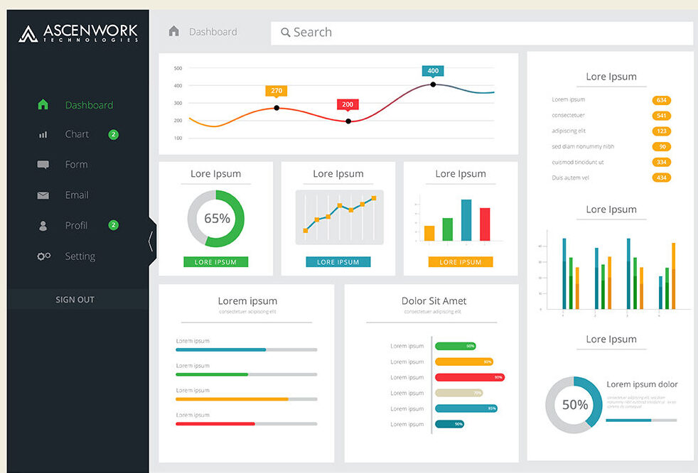
In today’s fast-paced tech landscape, Power BI Dashboard isn’t just a buzzword; it’s a strategic asset that can make or break businesses. And when it comes to harnessing the true power of data, interactive dashboards are the secret sauce.
Why do Interactive Power BI Dashboards matter in the tech world?
- Real-time Decision-Making: In tech, timing is everything. Interactive dashboards provide real-time insights, allowing tech professionals to make informed decisions on the spot. Whether you’re tracking website traffic, monitoring server performance, or analyzing user behavior, having instant access to critical data can be a game-changer.
- Data at Your Fingertips: Gone are the days of digging through spreadsheets and running complex queries. Interactive dashboards put a wealth of information at your fingertips, making it easy to explore trends, spot anomalies, and extract actionable insights effortlessly.
- Enhanced User Experience: In an era where user experience is paramount, interactive dashboards play a crucial role. They allow you to create visually appealing, user-friendly interfaces that engage and inform stakeholders, from customers to C-suite executives.
- Empowering Non-Technical Users: Not everyone in the tech world is a data scientist or analyst. Interactive dashboards democratize data, enabling non-technical users to access and interpret complex information independently. This fosters a data-driven culture across organizations.
- Scalability and Customization: Technology environments are diverse and ever-evolving. Interactive dashboards are highly customizable, allowing tech professionals to tailor their data visualizations to suit their specific needs. Whether you’re a software engineer, data engineer, or product manager, you can craft dashboards that align with your goals.
- Competitive Advantage: In a hyper-competitive tech landscape, staying ahead of the curve is vital. Interactive dashboards provide a competitive edge by enabling companies to spot trends, identify opportunities, and react swiftly to market changes.
- Data Security and Compliance: With increasing concerns about data privacy and compliance, interactive dashboards can be configured to ensure data security and adhere to regulatory requirements. This is especially critical in industries like fintech and healthcare.
Getting Started with Power BI Beginner's Quick Synopsis
If you’re new to the world of data visualization and analytics, or if you’re just beginning your journey with Power BI, you’re in the right place! Let’s start with the basics and get you acquainted with this powerful tool.
Designing Your Dashboard Pro Tips for User-Friendly Interface
Design is where data visualization truly comes to life. In this section, we’ll explore some expert tips for creating a Power BI dashboard that not only conveys insights effectively but also captivates your audience with its aesthetics and user-friendliness.
Data Preparation The Crucial Foundation for Effective Dashboards
Before you dive headfirst into creating dazzling visuals and interactive elements, remember that data preparation is the unsung hero of dashboard creation. It’s the solid foundation upon which your entire data-driven narrative rests.
Data Cleansing
Data Integration
Data Modeling
Data Transformation
Performance Optimization
Data Security
Effective data preparation streamlines the dashboard creation process, reduces the risk of errors, and ensures that your insights are based on accurate, reliable data. It sets the stage for creating visuals, applying interactivity, and telling a compelling data story.
Remember, a beautiful dashboard with flawed data is like a stunning house built on a shaky foundation. Invest time and effort in data preparation to reap the full benefits of your Power BI dashboard.
Creating Interactive Visualizations Unleash the True Potential of Your Data
Now that we’ve laid the groundwork, it’s time to dive into the exciting world of creating interactive visualizations in Power BI. This is where your data truly comes to life, engaging your audience and driving insights.
Choose the Right Visuals
Use Color Wisely
Highlight Key Insights
Interactivity
Focus on Clarity
Mobile Optimization
Slicing and Dicing Data Make Your Dashboards User-Driven
Welcome to the world of user-driven exploration in Power BI! Slicing and dicing data is where your audience gains the power to interact with your dashboard, tailoring their insights to their unique needs.
Slicers and Filters
Cross-Filtering
Bookmarks
Hierarchies
Optimizing Performance Ensure Your Dashboard Runs Smoothly
Performance optimization is the unsung hero of creating exceptional Power BI dashboards. Ensuring your dashboard runs seamlessly not only enhances the user experience but also guarantees that insights are readily available when needed. Let’s delve into some best practices to supercharge your dashboard’s performance.
Data Modeling Efficiency
Data Loading
Visual Best Practices
Use Direct Query
Aggregations
Performance Analyzer
Power BI is a business intelligence and data visualization tool developed by Microsoft. It allows users to connect to various data sources, transform and model data, create interactive reports and dashboards, and share insights with others.
Power BI and Tableau are both data visualization tools, but Power BI is developed by Microsoft, while Tableau is developed by Tableau Software (now part of Salesforce). Power BI offers tight integration with other Microsoft products and may be preferred by organizations using Microsoft ecosystems. Tableau is known for its flexibility and broader range of data connectors.
Power Query is a data transformation tool used to connect, clean, and shape data from various sources. Power Pivot, on the other hand, is a data modeling tool used to create relationships and calculations within data models. They often work together in Power BI to prepare and model data.
Power BI Desktop is a free desktop application used for creating reports and dashboards. It offers a rich set of data modeling, visualization, and interactive features for designing comprehensive data analytics solutions.
Power Pivot is a data modeling component used within Excel and Power BI. It enables users to create complex data models by defining relationships between tables, creating calculated columns, and measures to perform advanced calculations.
Power Query is a data transformation tool used to connect to various data sources, perform data cleansing, and shape data for analysis. It is available in Excel and Power BI.
DAX (Data Analysis Expressions) is a formula language used in Power BI and other Microsoft tools for creating custom calculations and aggregations within data models. It’s used to define measures and calculated columns.
Filters in Power BI allow users to narrow down and focus on specific data within a report or dashboard. They can be applied to visuals or entire pages to control what information is displayed.
Custom visuals in Power BI are third-party or custom-designed visualizations that extend the capabilities of standard visuals. Users can import these visuals to create unique and tailored data representations.
“GetData” typically refers to the process of connecting Power BI to various data sources to import data for analysis. It involves using Power Query to retrieve and transform data from databases, files, or online services into a format suitable for reporting and visualization.