SharePoint Visual Refresh 2026: What’s Changing and Why It Matters
The SharePoint visual refresh 2026 is a pivotal moment for enterprise intranet leaders and IT administrators managing digital workplaces across Microsoft 365. Microsoft’s advancing a unified design language that modernizes SharePoint’s interface, improves user experience, and aligns the platform with Teams, Outlook, and Office applications. Understanding what’s changing and why helps organizations prepare proactively, manage stakeholder expectations, and maximize adoption of these critical updates.
Key Takeaway
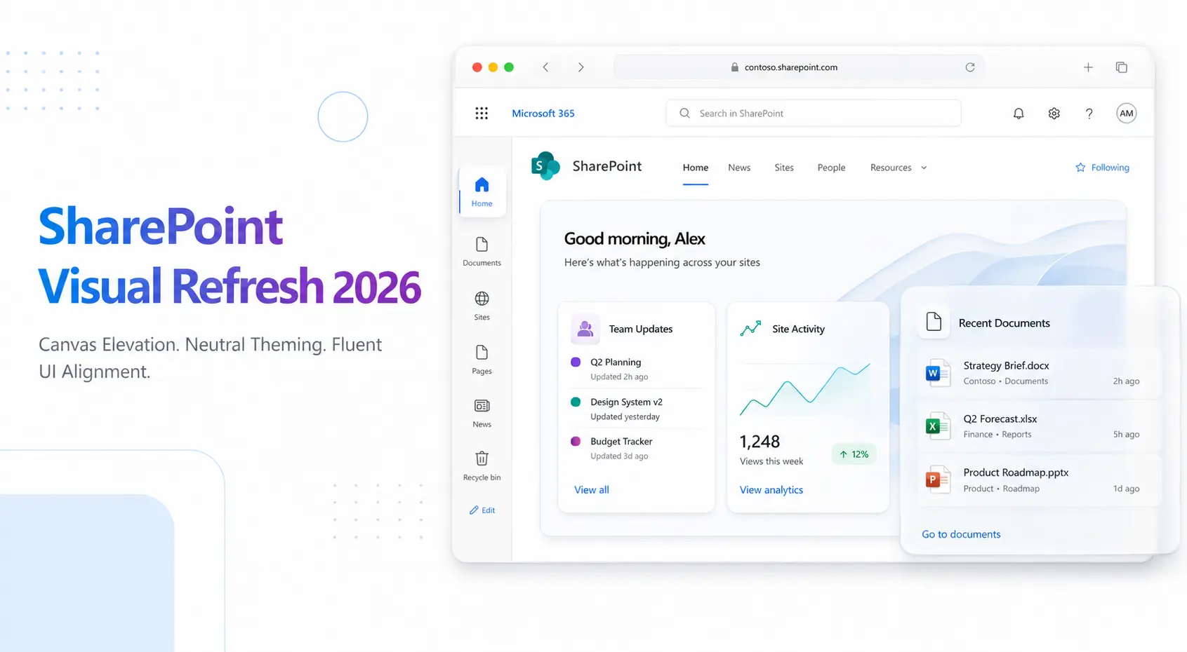
Microsoft’s 2026 SharePoint visual refresh introduces canvas elevation, neutral theming, and Fluent UI alignment. These strategic design changes enhance user adoption, accessibility, and consistency across Microsoft 365 without disrupting existing functionality.
In This Article
- Why the SharePoint Visual Refresh Matters Now
- The Core Elements Changing in the SharePoint 2026 Visual Refresh
- Key Changes by Component Type
- Preparing Your Organization for the SharePoint 2026 Visual Refresh
- How SharePoint’s Visual Refresh Impacts Different User Roles
- Real-World Implications: Common Scenarios
- Frequently Asked Questions
Why the SharePoint Visual Refresh Matters Now
User expectations for workplace software have fundamentally shifted over the past five years. Consumer-grade design standards, shaped by apps like Slack, Figma, and Notion, now influence how enterprise professionals expect to interact with productivity tools. Microsoft recognizes this trend and is investing in coherent, modern design across Microsoft 365 to remain competitive and drive tool adoption.
Here’s the thing: design consistency has real business impact. Gartner research on digital workplace modernization consistently links cohesive, modern interfaces to higher user adoption rates and employee satisfaction. Organizations that maintain outdated visual aesthetics often struggle with change fatigue and lower tool utilization, even when functionality is strong.
“Organizations with modernized digital workplace design report 34% higher user engagement and adoption compared to those using legacy interfaces.”
Digital Workplace Trend Report, Forrester 2024
And this refresh isn’t arbitrary. Microsoft gathered extensive telemetry, conducted user research, and aligned these changes with the broader Microsoft design system initiative. The SharePoint visual refresh 2026 is a strategic priority designed to solve real usability problems: improving visual hierarchy, enhancing accessibility, and reducing cognitive load for end users navigating complex intranet environments.
The Core Elements Changing in the SharePoint 2026 Visual Refresh

The SharePoint visual refresh 2026 introduces several interconnected design improvements that collectively modernize the platform. Let’s walk through each element so you understand the scope and strategic intent behind these changes.
Canvas elevation refers to the visual layering and depth applied to content areas. Rather than a flat, two-dimensional appearance, the new design uses subtle shadows, spacing, and elevation to clarify visual hierarchy. This makes it immediately obvious which elements are interactive, which are content containers, and how to navigate a page intuitively. End users spend less cognitive effort parsing the interface.
Neutral theming updates SharePoint’s color system to support more sophisticated branding while maintaining visual consistency. Instead of a limited palette, neutral theming allows enterprise organizations to apply brand colors more flexibly without visual conflicts. This is particularly valuable for organizations with strict brand guidelines seeking to customize their digital workplace without compromising design coherence.
That said, Fluent UI alignment ensures SharePoint’s visual language mirrors Teams, Outlook, and Office. Users switching between applications experience a seamless, recognizable interface. Icons, typography, spacing, and interaction patterns all reinforce familiarity, reducing the learning curve and support burden for IT teams.
On top of that, the refresh includes updated typography and spacing refinements that improve readability across devices. Larger, more intentional spacing between elements reduces visual clutter. Typography choices prioritize clarity and accessibility, particularly benefiting users with visual sensitivities.
Responsive design enhancements strengthen SharePoint’s mobile and tablet experiences. As remote work and field-based roles persist, these improvements ensure that intranet content and navigation remain intuitive across screens of any size.
Worth noting: organizations that fail to anticipate the SharePoint visual refresh 2026 risk several downstream challenges:
- Intranet designs may appear misaligned or outdated against Microsoft’s new visual direction, undermining perceived modernity and professionalism
- Custom branding may require adjustments to maintain intended visual impact within the new color and spacing system
- User training messaging may confuse stakeholders if you don’t proactively communicate the “why” and “what” of these changes
- Third-party solutions and add-ins may need vendor updates for visual consistency and compatibility
- Support requests may spike immediately after rollout if end users lack context or guidance on the interface changes
Key Changes by Component Type
The SharePoint visual refresh 2026 doesn’t overhaul the platform from scratch. Instead, it refines every major component type to improve usability and alignment with Fluent design principles.
Modern pages and web parts receive the most noticeable updates. The canvas itself gains subtle elevation effects. Web part containers feature refined spacing and improved visual separation. Editing controls remain accessible but less intrusive, creating cleaner published experiences that prioritize content over chrome.
In our work with clients, we’ve seen that list and library views benefit enormously from improved typography and spacing. Column headers are more legible. Row spacing reduces eye strain when scanning large datasets. Filter and sort controls integrate more seamlessly into the visual hierarchy without dominating the interface.
Navigation elements including menus, breadcrumbs, and wayfinding controls receive subtle refinements. Icons align with Fluent standards. Color contrast improves accessibility. Hover states and focus indicators become clearer, helping keyboard-only and screen-reader users navigate more intuitively.
Additionally, search results pages and discovery experiences benefit from enhanced visual presentation. Result cards display more structured information with improved readability. Metadata and relevance indicators are easier to scan. Thumbnail images and icons render more prominently, helping users quickly assess search results.
The site header and branding area updates provide more sophisticated control over logo placement, site title formatting, and theme application. You’ll gain flexibility to showcase brand identity without sacrificing design consistency or accessibility.
Expert Perspective
In our experience, organizations auditing their current intranet designs and customizations before the 2026 refresh rolls out gain significant competitive advantage. Proactive assessment identifies sites requiring redesign and allows phased modernization aligned with business priorities, avoiding crisis management after the automatic platform update.
Preparing Your Organization for the SharePoint 2026 Visual Refresh
Successful adoption of the SharePoint visual refresh 2026 requires structured planning and stakeholder engagement. A phased preparation approach minimizes disruption and positions your organization to leverage new capabilities quickly.
Step 1: Audit current intranet designs and customizations. Document your organization’s portfolio of SharePoint sites, pages, and custom components. Identify which sites receive heavy traffic, which contain critical business processes, and which rely on custom CSS or non-standard design patterns. Outcome: A prioritized list of sites for refresh readiness.
Step 2: Review current branding guidelines and color schemes. Evaluate how your organization’s brand colors, logos, and typography currently apply across SharePoint. Understand which elements may require adjustment within the new neutral theming framework. Outcome: Updated brand guidelines that leverage the SharePoint visual refresh 2026 while protecting brand consistency.
Step 3: Communicate early with stakeholders and site owners. Host working sessions with intranet governance teams, site owners, and department leaders. Explain the strategic intent behind the refresh and outline the benefits for end users. Outcome: Informed stakeholders who understand the “why” and become ambassadors for adoption.
Once Microsoft releases preview versions of the refreshed interface, Step 4: Test in a pilot environment. Deploy them to a test tenant or site collection. Evaluate how current designs, customizations, and third-party solutions render with the new UI. Outcome: Early identification of compatibility issues and design adjustments needed before production rollout.
Finally, Step 5: Plan user communication and training. Develop messaging highlighting the benefits of the new interface: improved intuitiveness, faster navigation, and consistency with other Microsoft 365 tools. Create brief video walkthroughs or help documentation. Outcome: Confident end users who embrace the new design rather than resist change.
How SharePoint’s Visual Refresh Impacts Different User Roles
The SharePoint visual refresh 2026 affects different user personas in distinct ways. Understanding these impacts helps organizations tailor communication and support strategies.
IT administrators benefit from improved design consistency, which typically reduces support tickets related to interface confusion. However, new theming options and governance capabilities require thoughtful planning. You should establish updated design standards and theming guidelines to maintain consistency across hundreds or thousands of sites.
Additionally, intranet managers gain an opportunity to refresh site designs and align visual presentations with modern aesthetics. High-traffic landing pages, department intranets, and news portals may benefit from redesign to fully leverage canvas elevation and neutral theming capabilities. This represents both an opportunity and a workload consideration.
Content creators and site owners experience improved visual hierarchy, making it easier to structure information intuitively. Mobile responsiveness improvements benefit contributors who work in the field or update content on tablets. Brief training on updated design patterns ensures site owners maximize the refresh benefits.
And here’s the thing: end users consistently report improved satisfaction with modernized, intuitive interfaces. The SharePoint visual refresh 2026 delivers clearer visual hierarchy, faster navigation, and consistency with other Microsoft 365 apps they use daily. This translates to reduced learning curve and faster task completion.
Real-World Implications: Common Scenarios
Concrete examples help organizations envision how the SharePoint visual refresh 2026 affects their specific environments.
Scenario 1: Enterprise intranet with 50+ site collections. A large organization with hundreds of divisions and departments manages numerous SharePoint sites. The refresh introduces an opportunity to modernize key landing pages first: corporate intranet homepage, HR resources hub, IT service portal. Then gradually refresh secondary sites over several quarters. This phased approach maintains governance while distributing workload.
Furthermore, Scenario 2: Organizations with strict brand guidelines. Companies with detailed brand standards often struggle when platform design changes. Fortunately, neutral theming in the SharePoint visual refresh 2026 actually provides more sophisticated control. Marketing and brand teams can refine color palettes and application standards to maintain visual identity within the new system, often achieving better results than before.
Scenario 3: Heavy reliance on third-party integrations. Organizations using ISV solutions that embed UI elements or overlay custom controls should coordinate with vendors to confirm refresh compatibility. Most major solution providers publish roadmaps and release updates proactively, but early communication prevents surprises.
For organizations with significant numbers of remote, field-based, or mobile workers, Scenario 4: Mobile-first workforce is particularly relevant. These teams spend more time on tablets and phones, making the SharePoint visual refresh 2026’s responsive design improvements a tangible productivity gain.
Frequently Asked Questions
Will my current SharePoint sites break or stop working after the visual refresh?
No. Microsoft maintains strict backward compatibility across platform updates. Existing sites will automatically receive visual updates, but functionality, data, and permissions remain unchanged. That said, you may want to review site designs to ensure they render optimally within the new visual language and leverage new design capabilities.
What exactly does “canvas elevation” mean, and why should I care?
Canvas elevation refers to visual depth and layering that makes interactive elements, content areas, and information hierarchy visually distinct. Rather than a flat page, the new design uses subtle shadows and spacing to create perceived depth. Why does this matter? It makes pages easier to scan intuitively and reduces cognitive load. Users understand immediately where to focus attention and how to interact with the page.
Do I need to completely rebrand my intranet immediately after the refresh launches?
Not immediately. However, you should plan a phased approach to refresh key landing pages and high-traffic sites over time. Aligning flagship sites with the new aesthetic demonstrates organizational commitment to modernization. Secondary sites can be updated gradually based on business priorities and available resources.
How does the SharePoint visual refresh relate to Teams and other Microsoft 365 applications?
Microsoft is advancing a unified design language called Fluent 2 across Microsoft 365. SharePoint’s Migration refresh is part of this broader effort to ensure consistency, so users experience a cohesive interface regardless of which application they’re using, whether SharePoint, Teams, Outlook, or Office. This consistency reduces confusion and accelerates user adoption.
Will custom web parts and third-party solutions still work with the refreshed interface?
Yes, existing solutions will continue to function. However, vendors may release updates to ensure their solutions render beautifully and remain visually consistent with the new SharePoint design. It’s smart to communicate with key solution providers and confirm their support timeline for the refresh.
Prepare Your SharePoint Environment Today
Understanding the SharePoint visual refresh 2026 and planning proactively positions your organization to adopt these design improvements confidently and maximize user adoption. We help enterprises audit current designs, establish modern governance standards, and execute successful refresh strategies aligned with business goals. Connect with our SharePoint specialists to discuss how to prepare for these changes.