

Power BI dashboards for customer experience
A customer experience dashboard shows whether customers are satisfied, where cases come from and how long they take to resolve, and which segments are promoters and which are not. Three screens cover it. We build them on your own survey and service data.
Request the sample pack
What it answers
Three questions every customer experience lead is asked
Each screen starts from a question. The figures show which segment, channel or issue theme to fix first.
- Is NPS above or below target, and where is it weakest?NPS against target, the months that are weakest, the segment and region that lead, and whether cases are resolved within the target time.
- Which issue themes create the most cases?Which channel has the lowest first-contact resolution, how many cases come per 100 orders, and where escalations start.
- Which segments are promoters, and which are not?Which segment has the most detractors, whether NPS is falling in one segment, how satisfaction differs by region, and which channel scores best.
The screens
Power BI customer experience screens
Three screens for the customer experience team. Open one to see it full size. Each comes with filters and drill-through, and we adjust measures, filters and branding to your business.
3 dashboards
Every number on these screens is sample data from a fictional retailer. No client data is shown. Your own logo replaces the AscenWork mark at the top left of each report.
How we define the main customer experience measures
A dashboard is only trusted if everyone reads the same number. We agree these definitions with you before we build, and write them down at handover.
| Measure | How we calculate it | What to agree first |
|---|---|---|
| Net Promoter Score (NPS) | Percentage of promoters minus percentage of detractors, from the 0 to 10 survey question. | Which survey wave and which response rate threshold are used. |
| Customer satisfaction (CSAT) | Average satisfaction score from the post-contact or post-purchase survey. | The scale and the question wording. |
| First-contact resolution | Cases resolved at the first contact, divided by cases closed. | What counts as resolved, and whether follow-ups are counted. |
| Average resolution time | Average hours from case opened to case closed. | Whether waiting time on the customer side is excluded. |
| Cases per 100 orders | Service cases in the period, divided by orders in the period, multiplied by 100. | Which order base is used. |
How it works
From these screens to your live dashboard
In a project, the dashboard connects to your survey and service data and refreshes on a schedule. You see working pages early, so you react to something real.
Connect
We link your systems and files, and check the data is complete.
Model
We clean and join the data, and agree each measure with you so everyone reads the same number.
Design
We apply your chosen look and your logo to every page, with a phone layout where it is needed.
Go live
The dashboard runs in Power BI with scheduled refresh, filters, drill-through and access by role.
What we connect
Where the data for these dashboards comes from
We confirm the sources on a short scoping call. These are the common ones for this dashboard.
Survey data
Survey responses and scores from your survey tool, exported or connected directly.
Service cases
Cases, issue themes, channels and resolution times from your CRM or service desk.
Orders
Order counts by period, so cases can be compared with volume.
Customer segments
Segment, region and channel for each customer, from your CRM or customer data.
Access by role
Row-level security, so a regional lead sees their region and the customer experience head sees the whole picture.
Our Power BI work
These screens are one part of what we do on Power BI
The same team builds the data model behind the dashboard, designs the report and keeps it running. Pick the part you need.
Power BI development
Data connections, model, measures, row-level security and scheduled refresh, built in your Power BI.
Power BI consulting
A review of your current reports and data, and a plan before you build.
Power BI designing
Clear, fast report design with a consistent look across every page.
Copilot and AI for Power BI
Ask questions of your data in plain language, with the right guardrails.
Case studies
Power BI projects we have delivered
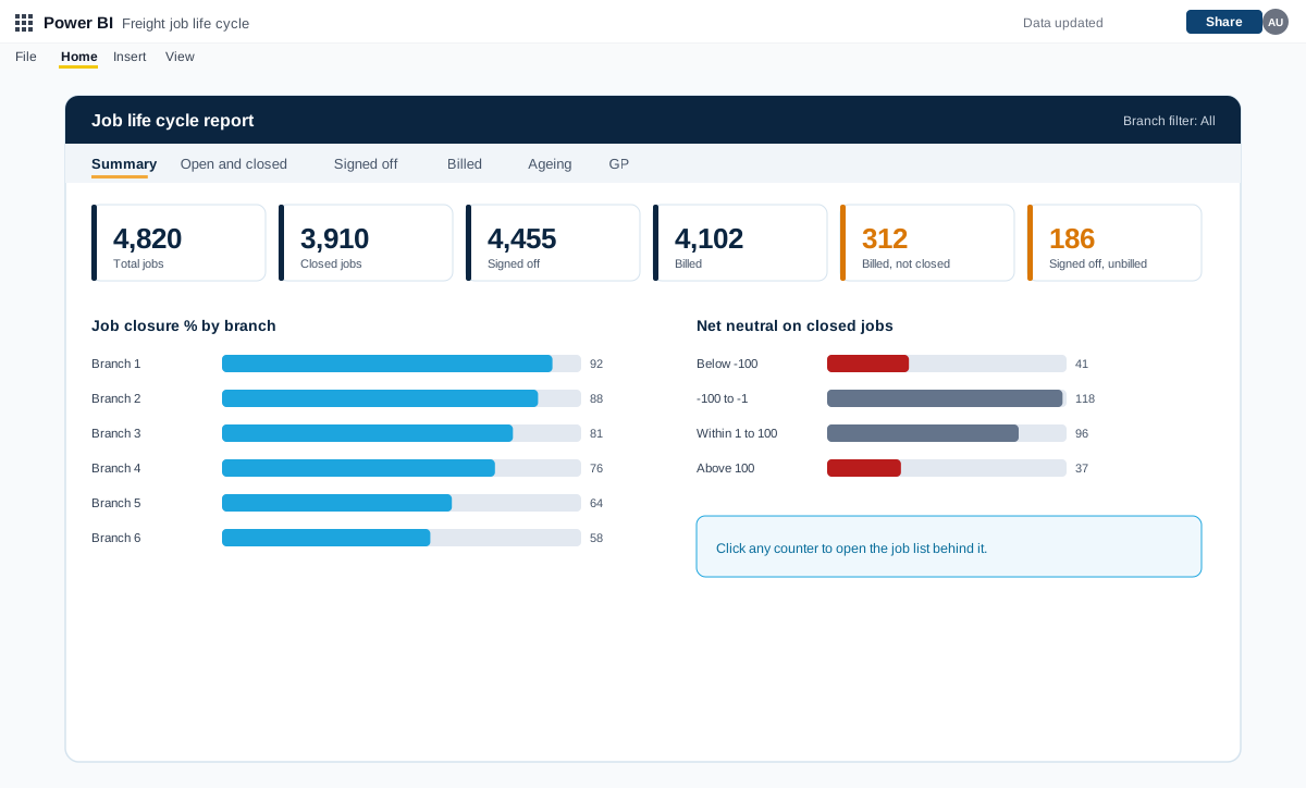
Power BI job life cycle, exception and debtors reports for a freight forwarder
A set of Power BI reports for a freight forwarding and customs clearing company with many branches. They follow every job from creation to closure and flag exceptions, pending billing, debtors and profit.
A freight forwarding and customs clearing company with many branches and a finance team at head office
Read the case study →Power BI · Energy and renewables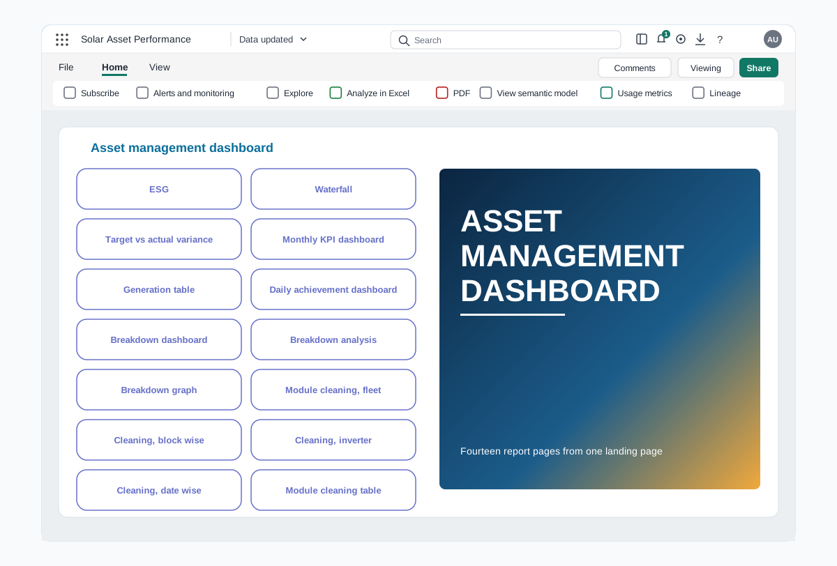
Power BI asset performance dashboards for a renewable energy portfolio
A Power BI report that follows generation, losses, breakdowns and module cleaning across every solar plant in a portfolio, from an executive summary down to the inverter.
A renewable energy company operating several solar plants
Read the case study →Power BI · Retail and consumer goods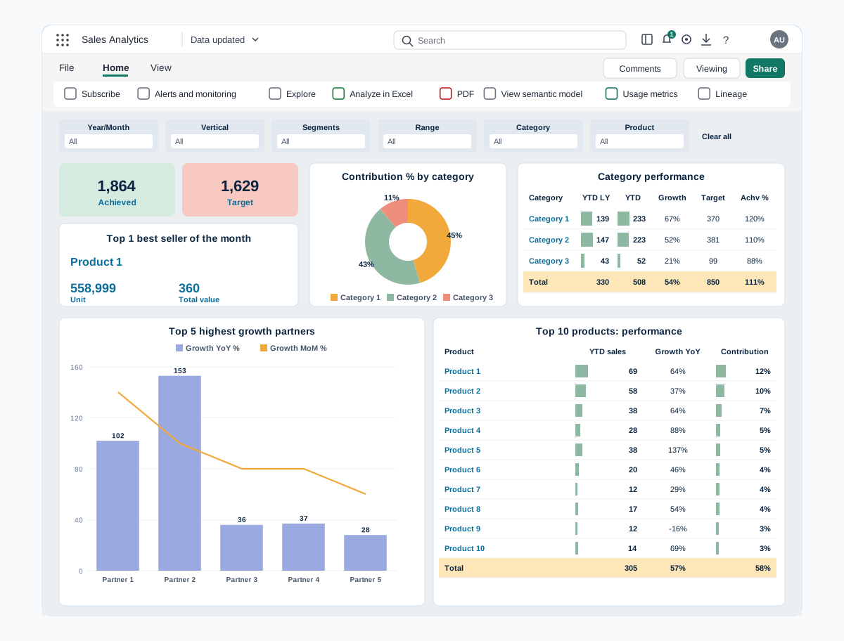
Power BI sales dashboards for digital channels and prescription sales
Two Power BI reports that bring sales data from every channel into one view. Digital sales covers partners, marketplaces, website and products, and Rx sales covers prescribers, zones, brands and field teams.
A skincare company selling through digital partners, its own website and prescription channels
Read the case study →Trusted by teams at












Power BI customer experience dashboard questions
What should a customer experience dashboard show?
NPS and satisfaction against target, case volume and resolution time, and promoters and detractors by segment. Start with the decisions the team takes each month, such as which issue to fix first.
How is NPS calculated?
Percentage of promoters minus percentage of detractors, from the 0 to 10 survey question. We agree the survey wave and the response threshold with you before the build.
Can it connect to our CRM or service desk?
Usually yes. Power BI connects to common CRMs, service desks, databases and Excel. We confirm each source on a scoping call.
Can a regional lead see only their own region?
Yes. With row-level security, a regional lead sees their own region, while the customer experience head sees the whole picture.
Is the sample pack free?
Yes. The design pack is free, and we email it to you as a PDF. Building dashboards on your own data is a scoped, paid engagement, which we quote after a discovery call.
How do we get a price and a timeline?
Book a free call. We learn your data sources, users and questions, then send a proposal with the scope, the assumptions and the price. Timelines depend on the number of sources and dashboards.
Related
More from our Power BI work
All dashboard templates
Fifteen dashboards by function and industry
Sales and marketing dashboards
Target, pipeline, ROAS and funnel
E-commerce dashboards
Online sales, funnel and returns
Leadership dashboards
CEO view and board pack
Power BI development
Build a dashboard on your own data
Power BI consulting
Review and plan before you build
Power BI designing
Clear, fast report design
Hire Power BI developers
Developers who join your team
Contact